
All
NISM Exam Mock Test Papers
SEBI - Investor Certification Examination
NISM Series II B - Registrar and Transfer Agents (MF) Certification
V A Mutual Fund Distributors Exam Series
NISM Series XIX-C AIF Managers Certification Exam
XX Taxation in Securities Markets
NISM-Series-XV - Research Analyst Certification Exam
NISM RTA MF
NISM Exam Mock Test Papers
NISM Series V A Mutual Fund Distributors Exam Series
NISM Series VIII - Equity Derivatives Exam Series

- Home
- Previous Year Papers
- RRB Exam
- Certificate Course in Canada
- IC38 MOCK TEST SERIES
- RRB Exam
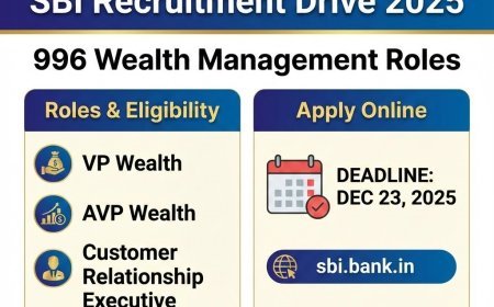
- SBI PO
-
NISM Exam Series
- All
- NISM Exam Mock Test Papers
- SEBI - Investor Certification Examination
- NISM Series II B - Registrar and Transfer Agents (MF) Certification
- V A Mutual Fund Distributors Exam Series
- NISM Series XIX-C AIF Managers Certification Exam
- XX Taxation in Securities Markets
- NISM-Series-XV - Research Analyst Certification Exam
- NISM RTA MF
- NISM Exam Mock Test Papers
- NISM Series V A Mutual Fund Distributors Exam Series
- NISM Series VIII - Equity Derivatives Exam Series
- NISM Mock Test
-
III Exams
- All
- IC27 - Health Insurance exam
- IC26 - ASSOCIATE - Life Insurance
- IC90 - Human Resource Management (HRM)
- IC S01 - Exam Principles and Practice of Insurance and Survey and Loss Assessment
- IC02 - LICENTIATE - Practice of Life Insurance
- Equity Derivatives Exam Series
- IC89 - Management Accounting
- IC86 - Risk Management Exam
- IC39 - Fraud Risk Management In Insurance
- IC24 - Legal Aspects of Life Assurance
- IC72 - Motor Insurance Exam
- IC14 - LICENTIATE - Regulation of Insurance Business
- IC56 - Fire Insurance Claims
- IC88 - Marketing and Public relations
- IC85 - Reinsurance Management Exam
- IC23 - Applications of Life Insurance
- IC22 - Life Insurance Underwriting Exam
- IC11 - LICENTIATE - Practice of General Insurance
- III Mock Test
- BNPM aptitude reasoning
- Login to Exam Portal >